Posts

Reference list

Technical Tutorial: Bilibili.com. 2021. [online] Available at: <https://www.bilibili.com/s/video/BV1v64y1f7y9> [Accessed 17 May 2021]. Docs.axure.com. 2021. Axure Docs · Documentation and tutorials for Axure Software's products and services. [online] Available at: <https://docs.axure.com/all-documentation/> [Accessed 03 May 2021]. Docs.axure.com. 2021. Timer Tutorial · Axure Docs. [online] Available at: <https://docs.axure.com/axure-rp/tutorials/timer/> [Accessed 17 May 2021]. Tubik Blog: Articles About Design. 2021. UX Design: How To Use Animations In Mobile Apps. [online] Available at: <https://blog.tubikstudio.com/ux-design-how-to-use-animations-in-mobile-apps/> [Accessed 6 January 2021]. Youtube.com. 2021. [online] Available at: <https://www.youtube.com/watch?v=9pRgHdJrCj8> [Accessed 6 January 2021]. Youtube.com. 2021. [online] Available at: <https://www.youtube.com/watch?v=HB9AVi-3ajw> [Accessed 6 January 2021]. Research/cultural contexts Co...

Evaluation

Image
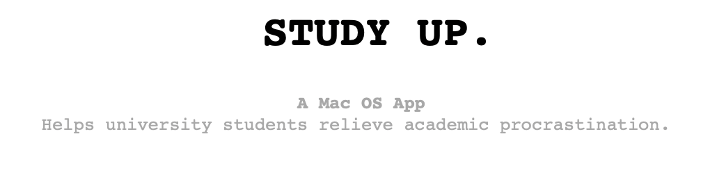
The degree project 'Study up' is an application for Mac OS devices, The purpose of this app project is to help university students relieve academic procrastination. The final project outcome is a link to the interactive prototype made by Axure RP10, and a promotional poster with a QR code, which is also suitable for flyers and website advertising. This prototype link can be opened by mac and windows system computers or iPad devices. It is not recommended to open it on mobile phones. Because the original intention of the design is to try not to let users be Cell phone interruption. This project is highly related to interactive art design and digital media art. It requires all the skills I learned about digital media art through the digital media art course, visual design, and interaction design.  Compared with other procrastination apps and task-management apps on the market, similar application interfaces on the market cannot attract users, so I have to remodel this point. To h...

Prototype video

Image
 

risk assessment

Image
 

promotional video

Image
 

Mock up

Image
  Freepik. 2021. Download Front View Of Laptop Mock-up For Interior Decoration for free. [online] Available at: <https://www.freepik.com/free-psd/front-view-laptop-mock-up-interior-decoration_10344828.htm#page=1&query=laptop%20mockup&position=2> [Accessed 17 May 2021]. Mockup, M., 2021. MacBook Air Free Mockup | Free Mockup. [online] Free Mockup. Available at: <https://www.free-mockup.com/downloads/macbook-air-free-mockup/> [Accessed 17 May 2021].

Promotional poster design for App

Image
The poster contains the basic information of the app function, as well as the link and QR code of the usable prototype. This is suitable for flyers, posters  This is the size suitable for website promotion  

Feedback from user test

I send that the link to the Prototype I made was sent to my friends online so that I can get some suggestions for improvement.  Positive part They think the interface style is very simple, if it can be downloaded, they will download, the function is what they need during the learning procrastination The task part is concise and clear All tasks are very boring when there is no animation effect at the beginning. After adding the effect, the interaction feels extra points. Invite friends to study together. This is good. we can’t go out and study together at home. The calendar piece is quite wrong. The introduction is clear at a glance. Where can be improved The schedule part can be more detailed They think that placing the mouse on the logo to change the emoji will increase interest It would be better if you could do more mouse click dynamics The study room can switch perspectives. For example, in a library, click on the table to enter the study room

Prototype test bug

Image
In the production of the prototype, because some pages need to be equipped with a calculation program when the prototype is clicked, there will be a pause. The operator needs to stay for 2 to 3 seconds to automatically jump to the next operation page. If there is no response after clicking, Then please refresh the prototype link. What happened when I was recording a prototype video

Axure RP10 - Interactive prototyping process

Image
After I used Figma to design the first draft, I imported the wireframe into Axure. I used the Axure RP 10.0.0 3826 version. Importing is not supported below this version. I have a student license, so I can use it for free.  The page size of the app I designed is 1440 1020, I imported all the artwork of the Figma into Axure, and then I can carry out the next step of interface design and interaction design in Axure.  After I put in the icons and illustrations, I started to interact with the interactive buttons on each page. Although the button fingertip interaction is relatively easy, it is very troublesome and trivial. If one of the buttons is not set to interact, the user will not be able to use it smoothly. Although the button fingertip interaction is relatively easy, it is very troublesome and trivial. If one of the buttons is not set to interact, the user will not be able to use it smoothly. I think the page is a bit monotonous, so I set the small task sign as a m...

Final UI version

Image
  I used photoshop to make a visual image on my desktop

final Interface elements

Image
 Final logo  In order to make the overall interface style consistent, I directly used the 4 task setting time modules in the task as the logo, which respectively represents the 4 task urgency level. When the user sees this icon on the desktop, they will first think of their task Final Icon   I added a smiling face to the design icon - Happy navigation bar Other additional buttons in the interface, such as ➕ these I will directly use the software's own icons. Award Medal Final guide page illustration and  user Avatar

UI- Style guide

Image
Font   Title and Subtitle - Courier  Text - Arial  Colour palette The main color of the interface is black, white and gray. with 4 bright color blocks, soft colors in the orange spectrum. Orange and yellow are usually associated with vitality, enthusiasm, fun, brightness, self-confidence, comfort, and pleasure. It reduces the pressure of the user population on task tasks, the colors around high efficiency and learning atmosphere Green can and blue represent learning efficiency and fresh vision.

Interface element improvements

Image
In the process of continuous improvement, I think that adding a smile to the icon design is more in line with my design philosophy and relieves the tension of the task function. I decided to use a black and white wireframe to design the guide page. The previous visual materials gave some inspiration, but I wanted to make my characters more distinctive, so I reduced the head of the character and enlarged the body.  

Visual design draft - Icon & illustration

Image
I have been thinking about whether the illustration of the guide page is only displayed in text or is a character illustration. In order to give users a better visual experience and understanding, I think that a combination of character illustration and text is used as the guide page. I started the icon and logo sketch design of the prototype interface.

Wireframe update

Image
Since I was not satisfied with the previous task page, I conceived two tasks with different layouts. I have updated some function page layouts. To be honest, the design interface really gives me a headache. Every time I think I won’t change it anymore. Final choice

Figma - app wireframe & Feature

Image
I used the Figma website to design the app wireframe. Figma is a browser-based UI design tool that can create multiple canvases on the page. I can view each app page as a whole, which is conducive to adjustment.  I basically determined the framework of each interface content and interaction flow of each page bottom Login page Guide page The guide page will introduce the function information and the general description of each function,I think it’s good for the user’s sense of use. Sign up Then there is the user registration landing page, because the user goal is for university students who have academic delays, the registration page needs to fill in user information and email, create a password, etc. Task According to the layout draft of a few tasks, I used a square task. On the right side, you can create new tasks and filter tasks. According to the Focus, Matrix method to plan the urgency of tasks. Assign tasks reasonably to reduce the pressure of Procrastination., it is...